Opt-in pop-ups. Modals. Boxes that appear after someone has spent a few minutes on your website. They're bad news.
As the internet becomes more and more inundated with stuff, it's a struggle to stand out. Surely pop-ups that encourage people to download eBooks, subscribe to your newsletter, and buy your product, can help you get closer to your prospects, right?
No.
Pop ups are a marketing trick, not a real strategy. They may work for a little while, but in the long run they're bad for your name, bad for your brand, bad for whatever you're trying to sell.
Pop-ups actually prohibit you from getting ahead. Go pop-up-less, and join those of us who do great marketing without.
What is a Pop-up?
Old school pop-ups open an entire new browser window and are rarely used anymore. Modals are what we see today. As you're surfing a website, a modal will appear to ask you a question, promote something, or guide you along.
Modals are good... sometimes. For example, if you're on an online banking website and have been idle for several minutes, a modal will appear and ask you if you're still there. This isn't to sell you something or turn you into a raving fan, it's to guide you along and protect you. This is the kind of message you want to see. You know the bank has your best interest in mind, doing its best to protect your security.
But in this post, I'm talking about pop-ups (modals) used for marketing purposes, ones that encourage you to download eBooks, sign up for newsletters, or follow a company on social media.
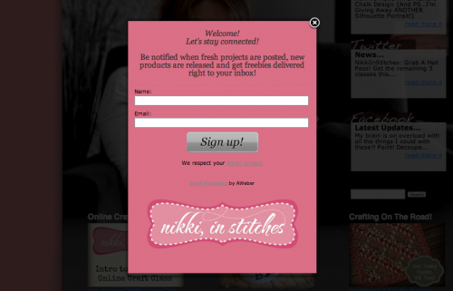
These pop-ups look like this:
Why Are Pop-ups a Bad Idea?
They're Annoying
You're reading a great blog post, soaking up tons of helpful info, when a pop-up appears in your face.
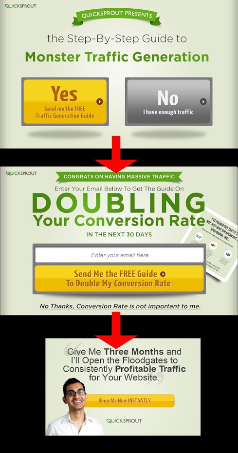
BAM!
When this happens to me, the last thing I want to do is reward the business by handing over my email address. I'm annoyed-- I'd rather go somewhere else on the web.
'Yeah, yeah, but you're a marketer, of course you're hip to the tricks.'
I don't buy it. Marketers aren't super humans-- and our visitors aren't stupid. The Nielsen Group posted an article with some data from users about their reactions to various advertising techniques, and **pop-ups were the most-hated form of advertisement. **
Why be hated?
They Can Ruin Branding Through Mean-Spirited Behavior
How can you convince people to opt-in to your email list? Go straight for the gut (literally).
Take this example from Women's Health Magazine. Within seconds of arriving at the website, you're greeted with this pop-up:
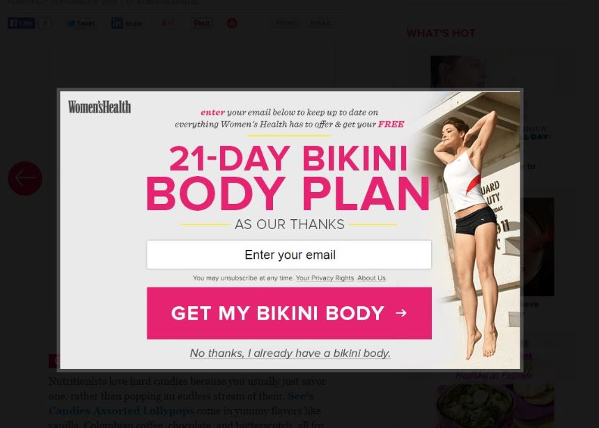
The choice is either 'get a bikini body' or declare that you 'already have a bikini body.' Not only is this manipulative, but it's also mean. Women's Health is preying on users' insecurities to boost their email sign ups.
But it gets worse: Women's Health is committing brand suicide. On their 'About Us' page, they declare:
Last I checked, Women's Health was making me 'feel' pretty bad. How can the bikini body opt-in pop-up support the brand's mission?
They Disturb the Overall User Experience
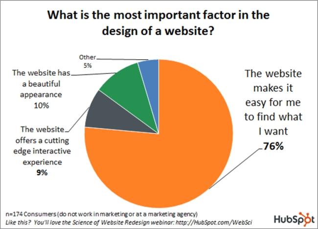
How do you judge a website? By how easy it is to find what you want! In fact, 76 percent of users say that finding what they want is the most important factor in a website's design.
If that's the case, how are pop-ups useful? While someone is reading an article or searching your site, you interrupt them with a pop-up that prevents them from finding what they're looking for.
I can hear you saying that a pop-up delivers what someone is looking for at an opportune time, but I'd argue that the overall user experience is entirely disrupted by these pop-ups.
'Just give the user the content they want on the page they are already on,' says Lewis Arch, Grasshopper's UI Engineer.
They Imply You Don't Trust Your Users
When you visit a website, you know how to get around. Why do you expect that your users are any different?
You may run a business, work in marketing, or design websites, but that doesn't mean you're any better at navigating the web than my grandma. If you want to subscribe to a newsletter, you figure out how to subscribe. If you want to follow a company on Twitter, you figure out how to follow them. If a company's stuff is that great, then you'll figure out how to stay connected.
Pop-ups asking to subscribe, sign up, or make a download imply that you don't trust your users to navigate your site. _Yikes. _I don't want to do business with a company that implies I have the brain of a mouse... do you?
They're Not Mobile-Friendly
Opt-in pop-ups don't work on smaller devices like our phones. As we use our smartphones more and more, we get even more frustrated with pop-ups. Because the screen of these devices is smaller, the pop-ups are more intrusive and harder to get rid of.
Here's a pop-up on my mobile device:
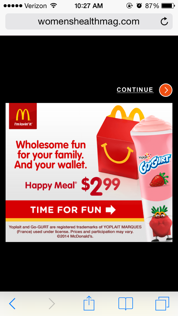
The only thing I see is the advertisement. I can't get the info I want, and I'm going to look somewhere else. Seventy-three percent of users say they've visited a mobile website that takes way too long to load. A pop-up is another barrier getting in the way.
They Imply You're Untrustworthy and Cheap
Yep, I said it. Using pop-ups makes businesses seem untrustworthy because they're relying on a cheap trick to gain subscribers. You're better off creating must-read insights that compel people to sign up for more. If what you give is great, then people will find a way to stay connected.
What Does The Data Say About Pop-ups?
Marketers love data. It proves that our efforts work, and it's satisfying to watch the needle go up. I couldn't do my job without data and analytics, but numbers don't tell you everything.
As Gary Vaynerchuk so famously says: just because you can't calculate the ROI of your mother doesn't mean that her presence didn't help you succeed.
People love to defend pop-ups with data with statements like this:
-
Pop-ups drive 1375% more subscribers
-
Opt-in pop-ups result in 1,000% increase in conversions
-
Recipe website gets 10x lift in Conversions
These numbers will make any marketers' heart reach 100 yard dash pace, but they're not sufficient, because there is so much they don't say.
For example:
-
How many potential readers did you lose?
-
How many people entered fake email addresses?
-
How did this affect your bounce rate?
-
How engaged are these subscribers?
-
Were these subscribers annoyed?
-
Has this damaged your brand reputation?
-
How many sales (not conversions) did these pop-ups actually result in?
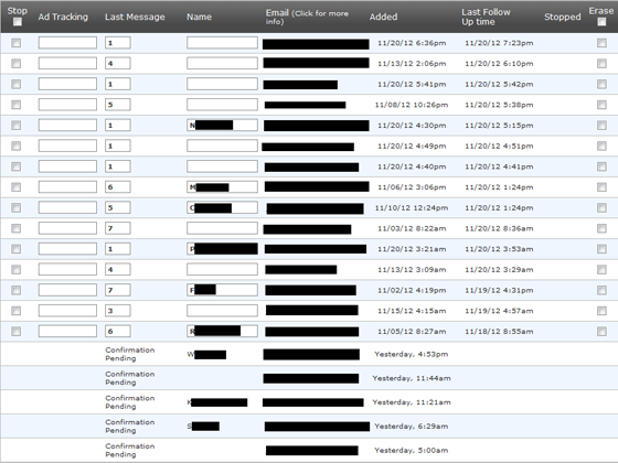
My friends at Unbounce posted this graphic showing that email subscribers who opted in via pop-ups have lower engagement, data that pop-up defenders are slow to share:
How Can I Go Pop-up-less?
Get a Hello Bar
Hello Bar is an easy-to-install widget that can be applied to any page on your site. The bar appears at the top of the page. You can customize the text, colors, and fonts to make it fit with the rest of your site. It's an unobtrusive way to ask visitors to do something. Visit HelloBar.com to get started.

Try Tweening
Tweening introduces new content naturally. To be honest, I didn't know what it was until one of our developers explained it to me. Tweening is motion between content. It involves putting some sort of automatic motion on the site, rather than an in-your-face popup.
'Short for in-betweening, the process of generating intermediate frames between two images to give the appearance that the first image evolves smoothly into the second image. Tweening is a key process in all types of animation, including computer animation.' - webopedia
Instead of pop-ups, employ things like infinite scrolling, changing the content on the page (integrating new content into the page), and sliding between different pieces of content in a natural way. Lazy loading is another strategy: when you scroll to the bottom of a page, it populates something underneath.
Fill Your Right Nav
Right navs are great for blogs. Instead of using a pop-up, you can populate the right nav with must-see content. Here's an example from Copyblogger:
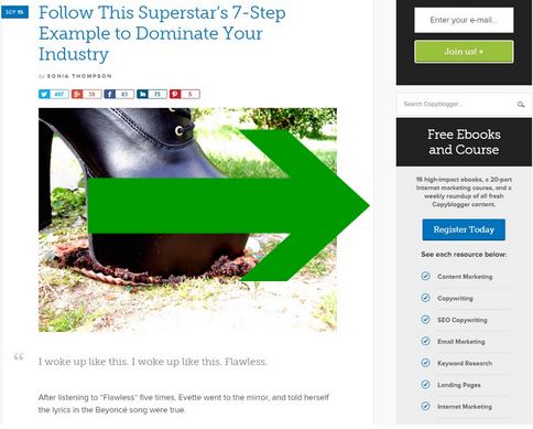
The site has two large items in their right nav: a call to subscribe to their newsletter, and a call to download and read their eBooks. Many bloggers fill their right navs with popular and related posts.
Employ Some Calls-to-Action (CTAs)
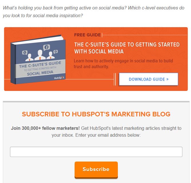
Calls-to-action, usually known as CTAs, encourage visitors to subscribe to an email list or download an asset. Sometimes they simply encourage someone to sign up for a service. Many companies place CTAs at the bottom of their blog posts to entice users to subscribe or download. Here's an example from a HubSpot blog post:
What Do You Think?
I'll go pop-up-less for the rest of my life. Great marketing has much more to do with how you make people feel, rather than how many heads you can count. I'm only one person. What do you think? Please share.

